Improving Ivanti Application Control Message Boxes
- Default Message Boxes
- Creating Better Message Boxes
- Updating Ivanti Application Control Message Boxes
- Be aware of High DPI Displays
- Conclusion
Ivanti Application Control (previously AppSense Application Manager) is an application whitelisting and privilege management solution; however, I think you’re likely aware of that since you’re reading this article. Application Control has a number of customisable message boxes that are displayed to the end-user for Windows application whitelisting or privilege elevation scenarios. In this article, I’ll discuss improving the end-user experience with some visual flair and text.
Default Message Boxes
Let’s take a look at a typical message box. Below is the default Access Denied message displayed to users on Windows 10 when attempting to start an application that hasn’t been white-listed.
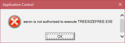
With apologies to Guy Leech (the original developer of AppSense Application Manager), this message box doesn’t fit with Microsoft’s recommended Windows 7 or Windows 10 desktop UI guidelines nor display anything useful to the end user that is useful or actionable. Side note - on Windows 10, I’d love to see this particular message as a notification instead because there’s no immediate action the user can take.
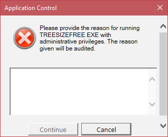
Here’s another message box - this one is shown for privilege escalation. Similar in a sense to a UAC dialogue box, but this forces the user to complete the action for elevating an application with a reason for taking that action that can be audited.
There are several scenarios where Application Control may display a message to the end user:
- Access Denied - execution of an application is denied
- Application Limits Exceeded - the end-user is prevented from running multiple instances of an application
- Self-Elevation - an end-user can elevate an application via Application Control instead of being granted administrative rights
- System Controls - the user can be prevented from uninstalling an application, clearing specific event logs or stopping services
- Time Limits - time limits can be put on application execution
- Self-Authorization - end-user can be given the ability to whitelist an application themselves
- Network Connections - controls can be placed on network destinations, paths or ports
So, potentially a reasonable level of interaction with the end-user and thus Application Control can have some impact on the perception of a user’s everyday experience. Fortunately, each of these message boxes is almost fully customisable - Ivanti provides the administrator with the ability to control both the appearance and text in the message to something that may suit a specific requirement or the environment into which it is deployed.
Creating Better Message Boxes
Dialog boxes suck (or at least a good chunk of them do). To understand why here’s an excellent article I recommend reading - The Magic of Flow and Why Dialogs Frustrate People. The dialogs interrupt user workflow and it’s safe to assume a user is typically seeing multiple messages in a single session (not just our Application Control messages).
Application Control supports customising the messages as well as the UI with HTML and CSS. With customisable notifications, the Application Control administrator effectively becomes a UX designer; therefore to provide users with the best experience possible and balance security needs of the organisation, we should consider carefully that experience both visually and narratively in the text displayed to the user.
When customising these I recommend paying careful attention to the language and tone of the text. Empowering a user to take the right, or no, action without generating unnecessary service desk calls is important. Here are my 3 recommendations for customising these messages boxes for an environment:
- Ensure the message boxes fit with Microsoft UX guidelines for Windows - apart from not visually assaulting the senses, fitting in with the standard Windows visual style will provide users with a sense that these messages are a part of the normal Windows desktop workflow
- Don’t overwhelm the user with explanatory text that they aren’t going to read anyway - avoid dialogue box fatigue. If you can, provide a link to more information, so that the user can choose to read up on why the system has been implemented
- Don’t assume the user is doing the wrong thing. Taking a default hostile stance via the language or wording used in the messages won’t foster a sense of trust. Yes, insider threats are often the main cause of security breaches, but IT can do its part in building team trust
I believe these to be reasonable principles to consider, but of course, some environments may have specific requirements.
Microsoft has published user interface guidelines for Windows for many years, with what I would call “mixed results” from the developer community. While good design isn’t easy, Microsoft has guidelines on Fonts, Style and Tone, and User Interface Principles that are applicable to the Application Control administrator.
Looking for Inspiration
Microsoft has specific message boxes in User Account Control that I’ve used as the basis for improving the messages boxes from Application Control; both visually and in the language/text. Here’s a typical UAC message box on Windows 10 - it provides some immediate visual feedback with colour and simple language for the user to act upon:
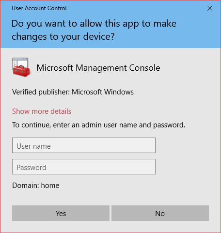
UAC (and SmartScreen) displays various message boxes depending on the action taken that have different colours to better provide the user with an immediate visual feedback.
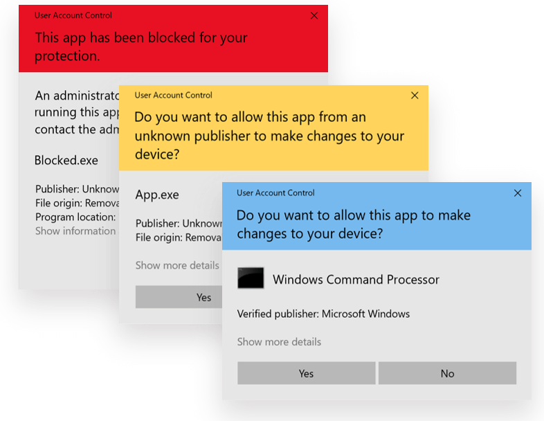
From top to bottom: blocked app, app with unknown publisher, app with a known/trusted publisher
Sticking with an established visual style, we can use these colours in our Application Control message boxes. I haven’t found documentation on the colours from Microsoft, so the hex values below might not be 100% accurate.
In addition to the visual style, we can use these as examples of the language to use in our customised Application Control message boxes.
Updating Ivanti Application Control Message Boxes
These message boxes are customisable via HTML and CSS, so we have the ability to exert a certain level of control on the look and feel. To enable the full level of customisation, you’ll need to be running Application Control 10.1 FR3, as the limit on the number of characters in some of the messages has been removed.
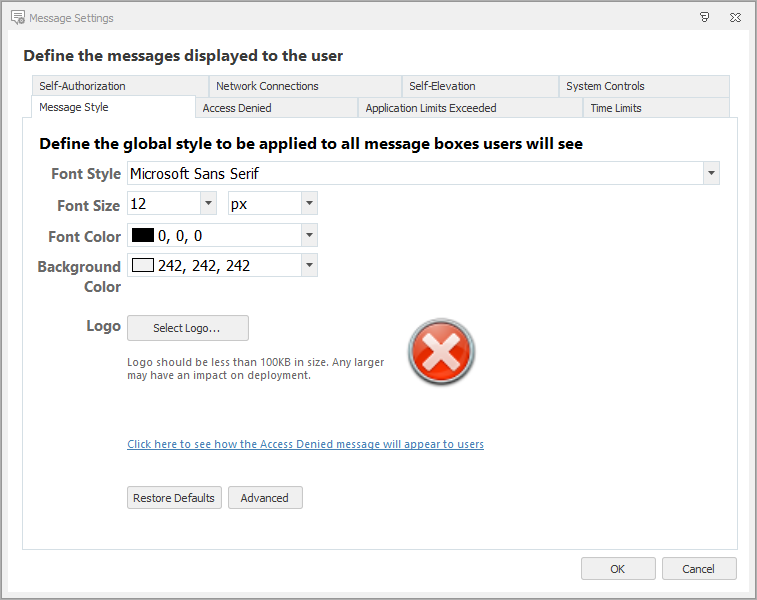
Here are the default Message Settings properties:
Under that advanced button, is the CSS used to customise the visuals. So the first thing we’re going to do is customise that CSS to align the visuals with Windows 10. I am maintaining an updated CSS file to completely replace the default CSS on GitHub, which means that anyone can fork the file, improve it and contribute.
There are a few things that the CSS does and provides customisation for:
- Changes the default font to Segoe UI, the default Windows font (instead of Microsoft San Serif). The font used in the user input box in self-elevation message boxes is changed to Consolas instead of Courier New
- Hides the red and white X graphic. By default, this image is shown on all message boxes and doesn’t actually fit in with the intention of all messages boxes
- Enables a header in the 3 colours shown above
- Gives buttons a Windows 10 look
- Prevents scrollbars from showing inside the message boxes - because the messages can only be set to a fixed height and width, some scrolling occurs even in the default messages shown in the images at the beginning of this article
At the moment, this CSS isn’t perfect and requires updates to fix the cutting off text on the right-hand side of the dialog box, but I think it’s a huge improvement over what’s provided by default.
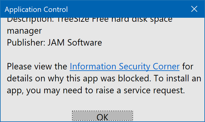
Access Denied
Let’s look again at the default Access Denied message box. This doesn’t fit into the Windows UI, doesn’t necessarily tell the user what’s occurred or tell them whether any further action is required.
With our new CSS in place, we can modify the HTML behind this message to reflect what’s going on, as well as provide the user with a link to a page with more information. Note that because my CSS isn’t currently perfect, I’m cheating a bit by putting a carriage return after “Running this app might put” so that the text isn’t cut off on the right-hand side of the message box.
<div class="header red">An app has been prevented from running to protect this PC.</div>
<div class="description">An unrecognised or unauthorised app was prevented from starting. Running this app might put
your PC at risk.

Blocked app: %ExecutableName%
Location: %DirectoryName%
Description: %AC_FileDescription%
Publisher: %AC_CompanyName%

Please view the <a href="https://servicedesk.stealthpuppy.com">Information Security Corner</a> for details on why this app was blocked. To install an
app, you may need to raise a service request.
</div>
Because we have a fixed height and width for the box, I’ve set the height to 690 pixels and the width to 440. Our new Access Denied message box now looks like this:
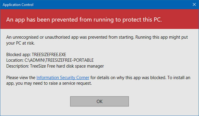
In this example, we are now providing the user with some immediate visual feedback, some reason as to why the application was blocked, some details on what was blocked and finally a link to more information (i.e. the action that the user can take). An external page can provide the user with a framework for understanding what’s going on and whether they should pick up the phone for the service desk (or not), with better detail and interaction than a message box could provide.
Self-Elevation
Now let’s do the same with the Self-Elevation action. Here’s the HTML:
<div class="header yellow">Do you want to allow this app to make changes to your device?</div>
<div class="description">App name: %ExecutableName%

<br/>This action will run this app with elevated privileges. Please provide the reason for taking this action. This information will be logged and audited.

Improper use of elevated applications are in violation of the <a href="https://servicedesk.stealthpuppy.com">Acceptable Use Policy</a>.</div>
I’ve set the height to 770 pixels and the width to 460. Here’s the result:
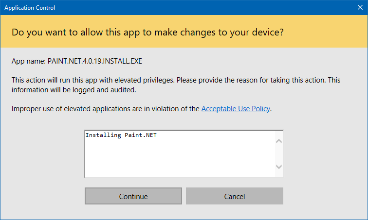
In this example, we aren’t bombarding the end-user with text nor assuming what they’re doing is a hostile action. If you’re an IT Pro or a developer, there’s a good chance you’ll need to elevate an application several times during a single session, so this could be something you see multiple times a day.
System Controls
For a simple example, let’s update the System Controls message.
<div class="header blue">Uninstall of %ApplicationName% is not permitted.</div>
<div class="description">Removal of this application has been denied to protect the integrity of this PC.</div>
Which then looks like this:
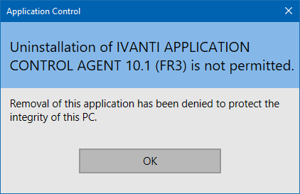
Here we’ve used blue to differentiate this from the previous two messages.
Be aware of High DPI Displays
Note that today Application Control doesn’t support high DPI displays or scaling above 100% very well. Because those dialog boxes are a fixed size and the contents don’t scale, you get something like this:
Ivanti is, of course, aware of the issue and I assume there’ll be a fix in a future update. Until then, at least on Windows 10, you can override the high DPI scaling behaviour. The Application Control Agent folder has a number of executables that run each of the messages. For example, to fix the scaling on the Access Denied message box set compatibility of AMMessage.exe that the high DPI scaling behaviour is set to System (Enhanced).
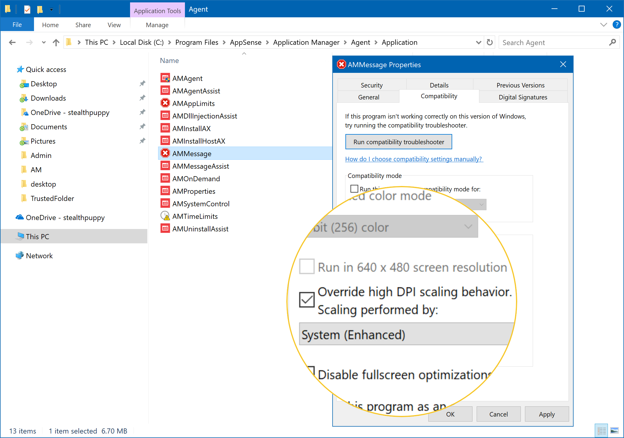
Once set, the message box will be set to its correct size and scaled up on high DPI displays, thus the box may look fuzzy depending on resolution and scaling. To avoid setting this on each executable individually on each end-point, use Group Policy or the Application Compatibility Toolkit to set these properties.
Conclusion
In this article, I’ve discussed how to improve the Ivanti Application Control message boxes for both visuals and text. With some effort, we’ve updated the style to better fit in with Windows 10, but these look right at home on Windows 7 as well. Additionally, the text has been improved to provide users with (hopefully) just the right amount of explanation, enabling them to take effective action if needed.
The custom CSS streamlines the visuals and better aligns the message boxes with UI guidelines from Microsoft. While I’ve made the CSS available on GitHub, it could do with some improvement. Opening this up to the community will enable feedback and updates.